
Scatter Graphs and Triangular Graphs
Scatter graphs and triangular graphs. Topics covered in this section are:
- Scatter graphs
- Triangular graphs.
Overview
Scatter graphs
Purpose: Scatter graphs are used to show a relationship or correlation between two sets of paired data (variables) – for example, population size and number of services, or distance from the source of a river and average pebble size (e.g. pp. 14 and 15 of your study guide, pebble analysis).
Triangular graphs
Purpose: Triangular graphs are used to represent different types of data and are useful when three components are involved. The most important properties of the graphs are that each axis represents a percentage value, and the angles are drawn at about 60° to make data more readable.
Triangular graphs can also indicate the relative dominance of one component over the others and can be easily updated when changes occur in the data. They are useful when identifying changes over time.
For more on this topic, have a look at our Advanced Higher Geography Study Guide – New Edition, pp. 62–63.
Related Videos
When do you use a scatterplot graph?
See how to draw a scatter graph:
See how to draw a triangular graph:
Activities
Follow the links below for sites providing good information, examples and tests for scatter graphs:
Scatter Graphs Worksheets, Questions and Revision
Download a triangular graph template from geographyfieldwork.com.
Use the OECD iLibrary to source data sets.
Quizzes
Click a link below to take a topic quiz:
Thoughts
Think about the possible links that scatter and triangular graphs have with other geographical techniques in your study guide.
Scatter graphs:
- use linear regression analysis to calculate the regression line to achieve a greater level of accuracy
- assuming there are sufficient data, you could use the Spearman rank correlation coefficient or the Pearson product moment correlation coefficient to test whether there is a significant statistical relationship
Additional content on Scattergraphs
The following practice questions have been sourced from classroom resources and from TeachItGeography. You can also find additional material on the SQA website under Geography – Advanced Higher – Past Papers and Marking Instructions.
Question 1
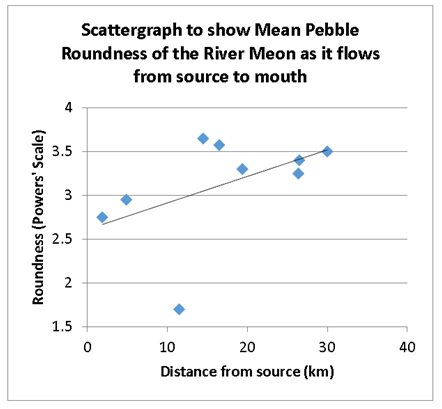
These have the potential to allow you to investigate the relationship between two sets of data. The graph below was produced by Excel giving a ‘line of best fit’, which it has done with a black line. However, notice the ‘outlier’ or ‘residual’ i.e. points that lie some distance away from the line. These can be useful as they can give you an idea of a further area for investigation (i.e. go back and sample again).
(a). Which point is a residual (circle it) and why do you think it might be there?
(b). Pretend the point was not there – draw another line of best fit.
Additional content on Triangular Graphs
The following practice questions have been sourced from classroom resources You can also find additional material on the SQA website under Geography – Advanced Higher – Past Papers and Marking Instructions.
Question 1
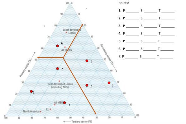
These are plotted on special graph paper in the form of an equilateral triangle. It can only be used for a whole figure that can be broken into 3 components. Once plotted clusters can emerge and classifications can also take place.
What are the primary, secondary and tertiary percentages for the following:
Question 2
A triangular graph is used to show geographical phenomena composed of three different parts. The graph can best be understood by identifying the components at the apexes of an equilateral triangle. The graph below identifies a schema for simple soil colour identification. When soils are freely drained soil colour can be traced back to three main colours that produce:
- black (in humus-rich soils)
- red (in iron-rich soils)
- white (in soils rich in silicates and salts).
If perpendicular lines are dropped from each apex to the opposite side of the triangle then movements along a colour gradient can be read. Thus a chestnut coloured soil would contain no white and equal amounts of black and red pigments. Explain the colour of the following soils:
- Orange
- Dark grey
- Chocolate
Question 3
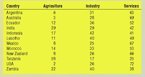
The graph below shows the percentage of working population employed in agriculture, industry and services, has numbers arranged in a counter-clockwise direction. Note how the internal lines extended beyond the edges of the triangle make interpreting this graph simpler. The letters on the graph refer to the mix of the three variables.
Task:
(a) Plot the data on to a triangular graph and insert an appropriate letter for each country. (Download a Triangular Graph template by clicking here)
(b)Explain which countries
have the highest standard of living?
have the lowest standard of living?
you think are developing countries?